
Interpret data
You can use a variety of charts to interpret and analyse your data in the label, train, and test centers. In the label center, you can use the following:
- Class distribution
- Wafer map
In the test center, to interpret your data, you can also use the confusion matrix.
Tip
Change the platform layout to the split-view mode when working with charts and data filtering.
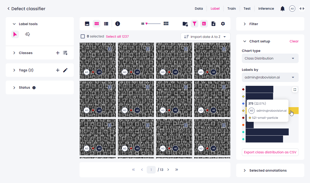
Class distribution
The class distribution chart shows the number of samples per class by one of the sources—user or the Prediction tool. This allows detecting the unbalanced class distributions that may cause problems in classification models. The class distribution chart for other sources is available in the train and test centers.
To view the class distribution chart in the label center
-
In the label center, on the top toolbar, click the charts button.
-
On the right, in the Chart type field, select Class distribution.
- In Labels by, select the source whose labels will be displayed in the chart.
-
Once you have built the class distribution chart, you can do the following:
-
To view the number and percentage of samples labeled with a certain class, hover over the respective bar.
-
To filter the samples by class, click the bar next to the necessary class. To display all the samples, click the same bar again.
- To export the chart as a CSV table, click Export class distribution as CSV.
-
-
To maximize the chart to full screen, in the upper-right corner of the chart, click
 .
. - To minimize the chart, in the upper-right corner, click
 .
. - To clear the chart setup, in the upper-right corner, click Clear.
When using the chart, note the following:
- If you update annotations while the chart is open, you will be prompted to refresh the chart.
- If you apply a filter when the chart is already open, the filter isn't considered. To refresh the chart, click Clear in the upper-right corner of the Chart setup panel, and then set up the chart again.
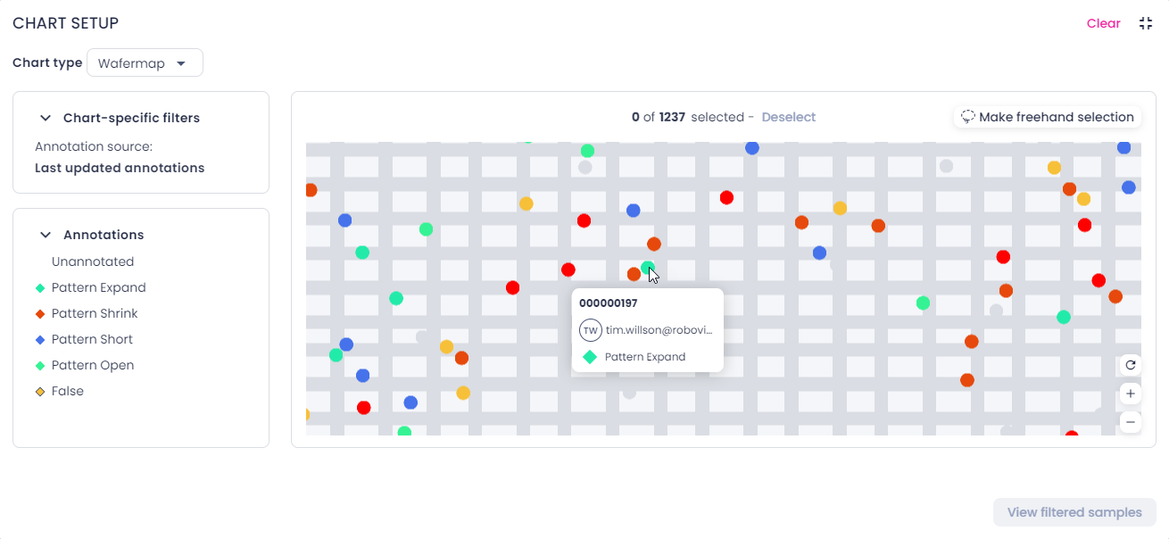
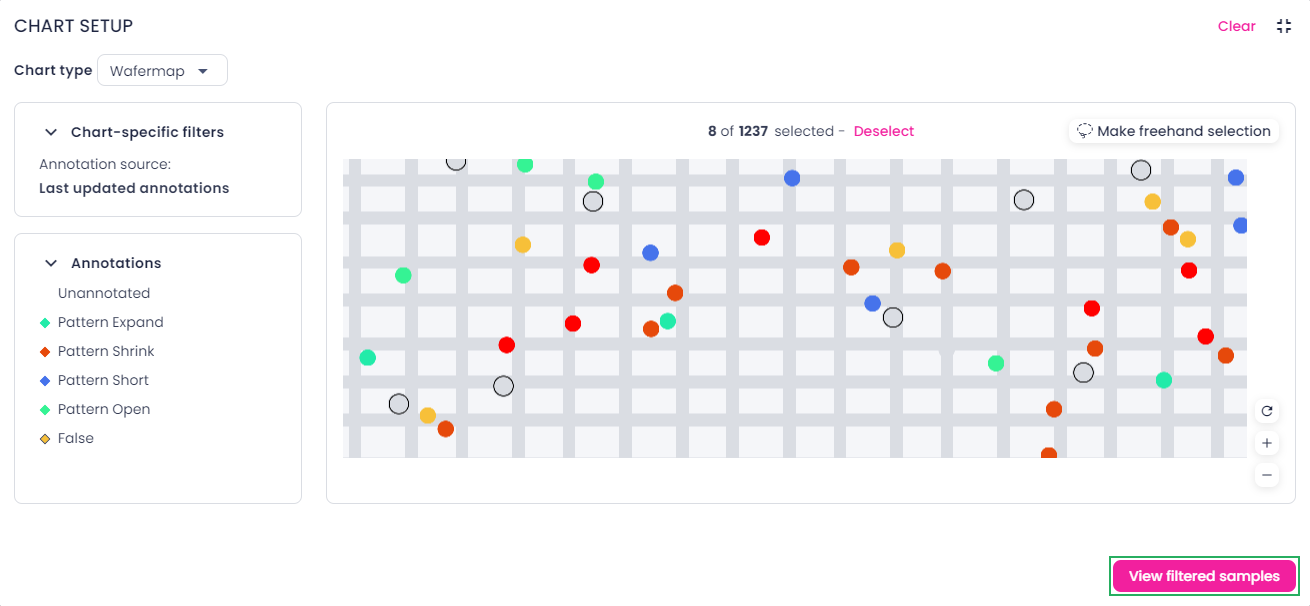
Wafer map
A wafer map features samples on the wafer and a grid that outlines the dies. Each sample is represented with a dot:
-
Labeled samples have the same color as the annotation class. If a sample has annotations from several labelers, the most recent annotation is displayed.
-
Unlabeled samples are marked with gray.
You can use the wafer map to do the following:
- View all samples on the wafer at the same time.
- Get an overall idea about the location of the problem.
- Closely examine individual regions of the wafer for defects and anomalies.
To view the wafer map
-
In the label center, on the top toolbar, click the charts button.
-
In the right panel, in the Chart type field, select Wafer map.
- To maximize the chart to full screen, in the upper-right corner of the chart, click .
-
To navigate the chart, do the following:
- To zoom in or out, move the wheel button or use the buttons in the lower-right corner of the chart.
- To pan the chart, click and drag.
- To reset the zoom level, in the lower-right corner of the chart, click
 .
.
-
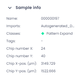
To get more information about a sample, hover over the needed dot.
You can view the sample name, annotation source, and class name.
Note
To find the exact coordinates of the sample, in the single view, on the top toolbar, click the info button (
 ).
).
-
To view specific samples in the label center, do one of the following:
-
By using the Ctrl key:
-
Press and hold the Ctrl key, and then click the dots that you want to view in the label center.
Selected samples have a black outline.
-
To view selected samples in the label center, in the lower-right corner of the chart, click View filtered samples.
-
-
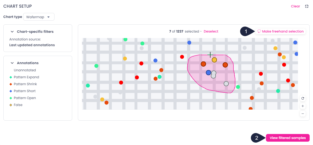
By making a freehand selection:
-
In the upper-right corner of the chart, click Make freehand selection (1).
Alternatively, you can press and hold the Shift key.
-
Press and hold the mouse button and move the pointer around the samples that you want to view in the label center.
The number of selected samples is displayed above the wafer map.
-
To add more samples to the current selection:
- Click Make freehand selection.
- Press and hold the Ctrl key.
- Press and hold the mouse button and move the pointer around the samples that you want to add to the current selection.
-
To view selected samples in the label center, in the lower-right corner of the chart, click View filtered samples (2).
-
-
-
To clear the selection in the chart, click Deselect above the wafer map or double-click anywhere outside the selection.
- To minimize the chart, in the upper-right corner, click .
- To clear the chart setup, in the upper-right corner, click Clear.
When using the chart, note the following:
- If you update annotations while the chart is open, the wafer map will automatically reload.
- The chart takes into account the filters you have applied. When the filters change, the wafer map reloads automatically.
- The data displayed on the wafer map shows the most recent annotations of the currently filtered samples. Therefore, if you use filters to view the samples which originally had the unknown class, the wafer map will show to what they got relabeled.
- If your project has multiple KRF imports, the wafer map shows the grid from the most recent import. If the latest KRF lacks a grid, none will be displayed, even if the previous import has one.
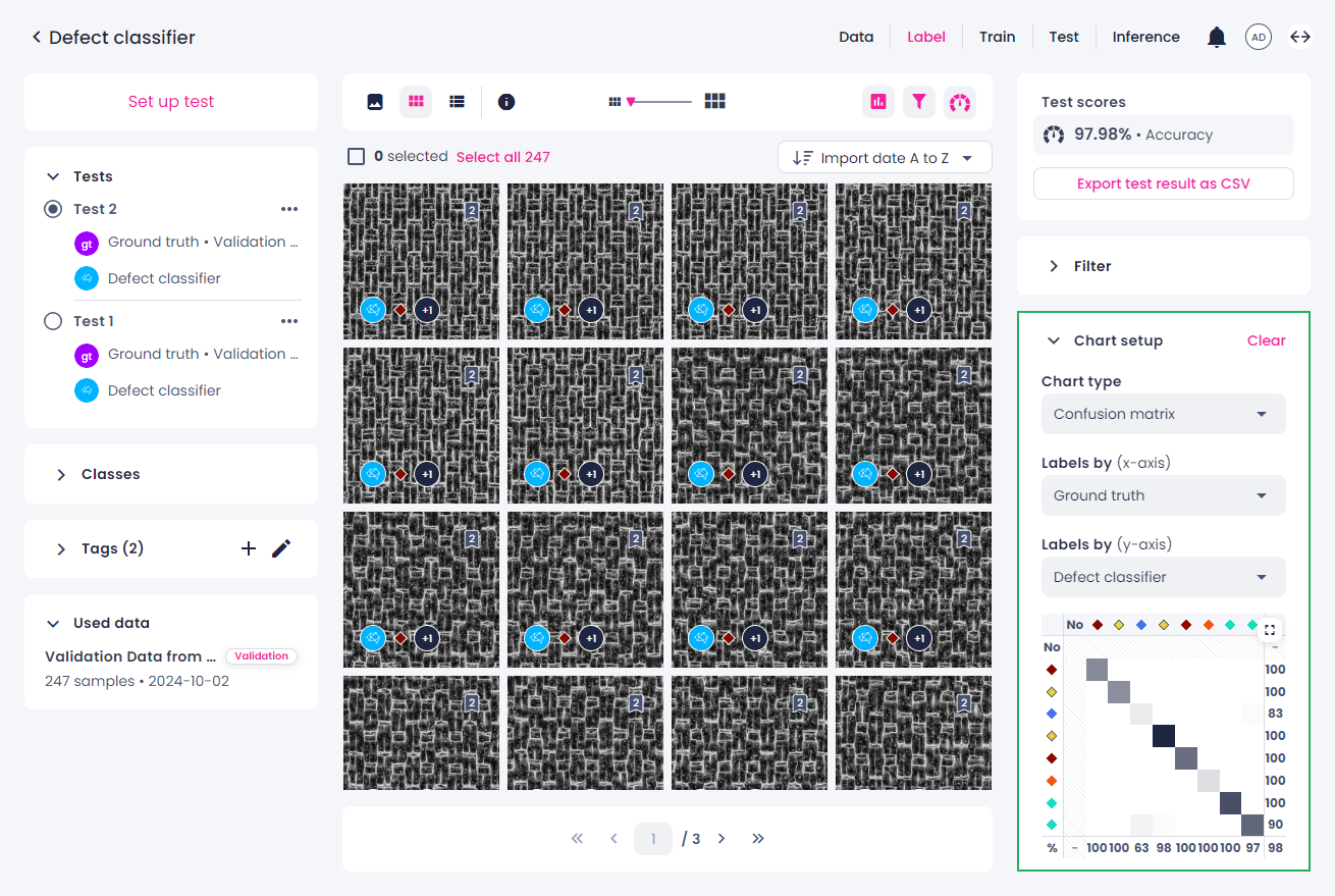
Confusion matrix
Using the confusion matrix in the test center, you can compare a model against the ground truth or another model. The confusion matrix makes it easy to tell how accurately a model categorizes each annotation and where it might be making errors.
Once a test is done, the confusion matrix is displayed in the right panel of the test center.
When using the chart, note the following: if you apply any filters in the Filters panel, and then open the confusion matrix, it won't consider them. The number and percentage of samples (image classification) or annotation pairs (object detection and instance segmentation) that are labeled with a certain class will be incorrect.
To view the number and percentage of samples labeled with a certain class, hover over the respective cell.
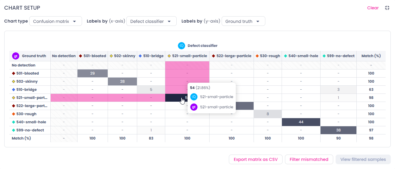
You can filter samples categorized by the confusion matrix. For this, do one of the following:
- To view the samples per one category, click the necessary table cell. To go back to all the samples, click the same cell again.
- To select multiple cells of the matrix, hold the Ctrl/Cmd key, and then select the necessary cells. This shortcut is only available when the matrix is minimized.
-
To view all mismatched (off-diagonal) samples, click the Filter mismatched button below the matrix. To clear the selection, click Deselect mismatched.
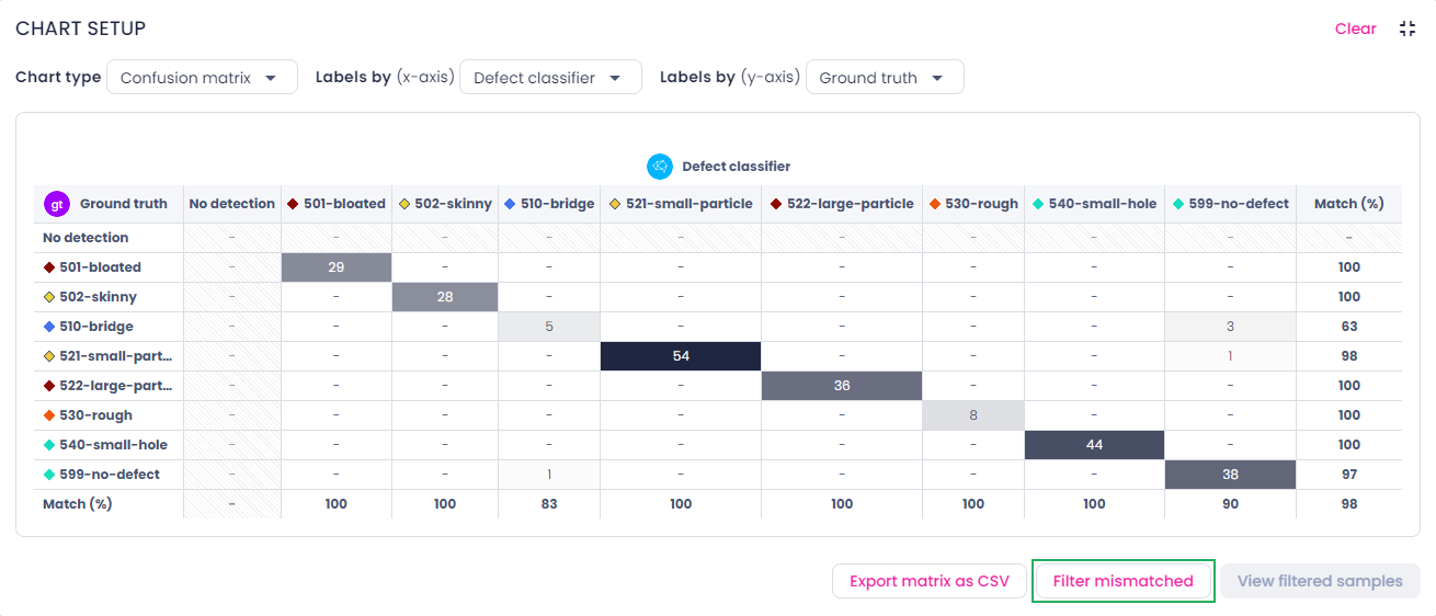
To export the chart as a CSV table, click Export matrix as CSV.
To clear the chart setup, in the upper-right corner, click Clear.